In 2018, Digital has found itself under the spotlight. Having received its fair share of positive and negative press, some preach the power of targeting whilst others will remind you that there is a lack of proven viewability. At Ipsos MORI we recognise that viewability doesn’t necessarily equal visual attention, but by adapting to digital’s strengths you can still land your brand messages. The often-forgotten secret of digital advertising is that it’s just advertising. All the guiding principles of making a good ad still apply and success depends on the strength of your creative. Great digital creative can gain attention and impact the brand (even if it’s just a simple banner ad).
Putting all your eggs in the viewability basket
Despite negative press and shaky measurement figures digital advertising spend is increasing1 and advertisers are increasingly using digital for brand building goals2. But, there is a fly in the digital ointment, viewability (the currency of the digital ad trade) doesn’t necessarily equal visual attention. Building on Lumen’s work on the attention economy (Attention 1.0), which investigated which digital ads are likely to be looked at, this paper identifies the actual brand impact that digital advertising has. Even if you gain a viewer’s attention amongst other online real-estate, visual attention doesn’t guarantee brand impact. After all, the goal of an ad isn’t to be viewable, it’s to positively affect the brand by activating a response in the short term or building a long-term relationship.
Brands face the challenge of creating ads that: stand out against other adverts, distract from the content the user’s looking for, and overcome the general bad will towards advertising. According to our Global Trends report, 90% of online users in Britain find online advertising annoying and 61% dislike the ads in their social newsfeeds (compared to just 35% who dislike ads on TV). The result is that nearly half (47%) of all online users in Britain claim to use ad blockers.3To even have a chance of delivering on consideration, purchase intent, ROI, or building long-term brand relationships, digital ads must be compelling and perform at a glance.
In partnership with Lumen, Ipsos MORI has undertaken a bespoke research project to ascertain what it takes to gain a viewer’s visual attention and, more importantly, how this can be converted to brand impact.4 By combining Lumen’s eye tracking capabilities with Ipsos MORI’s Connect:Digital methodology we have established a set of criteria for making the most of your digital ads.
Connect:Digital is a live website (available on desktop and mobile web browsers) that allows us to serve your digital ads in a live environment. We then follow-up with a survey to understand the impact of the digital advertising being tested. For this study, we used a test and control methodology where we tested eight different rich media display ads across three different ad formats (MPU, DMPU, Banner). By using this methodology, we could derive the impact the test ads had on brand perceptions.
Viewability does not necessarily equal visual attention
First things first, just because an advert is on screen (or viewable) doesn’t mean that it will be seen. Viewability, defined as 50% of an adverts pixels on screen for one second or more, only describes whether a user can see an ad. As previously mentioned, the internet is full of content competing for a user’s attention and the consensus on advertising isn’t positive. Just because an ad is viewable, does not mean that a user will look at the ad and view it. Data from the Lumen panel suggests that in live web browsing, 82% of ads that are technically viewable don’t get viewed.
82% of ads don’t get viewed
For this research, we purposely increased the viewability of our ads, placing them above the fold and in prominent positions, to test how integral viewability is to ads success. We also used Rich Media ads to help draw the visual attention of the user. If an ad couldn’t cut through given these optimum conditions, it was unlikely to perform well in live web browsing.
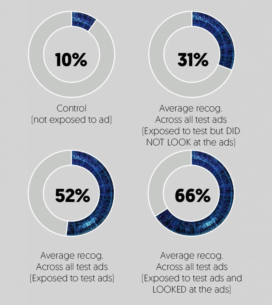
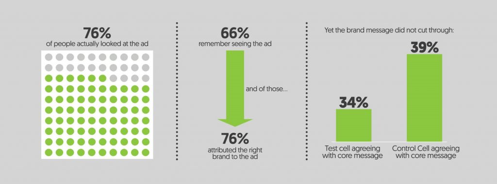
Despite the optimal conditions, our eye-tracking data showed that only half (52%) of our viewable ads were looked at. Breaking this figure down by ad format, we identified that DMPUs had the greatest share of visual attention (consistent with Lumen normative data). Of the digital ads tested, 72% of participants looked at a DMPU vs. 53% and 51% respectively who looked at the MPU and Banner test ads.

Eye Tracking data showed that the average dwell time for the test ads was 3.3 seconds. In principle this sounds like good news for advertisers, 3 seconds is more than just a glance at an ad. However, these 3 seconds were not necessarily consecutive and don’t guarantee the ads message will be understood, it all depends on how quickly an ad can deliver its message.
The ads that got the best visual attention and longest dwell times utilised the following three key creative assets:
- Animation: animation helps attract attention, however, the pace must be balanced. Whilst ads that cycled through different frames quickly performed better than slower rich media ads, ads that move too quickly struggle to be understood.
- Use of celebrity/recognisable characters: ads with the longest dwell times used well-known TV characters and cartoons to gain attention.
- Be bold and distinctive: the use of bold brand colours, phrases or characters connected to the brand, or other distinctive assets reinforced the brand and aided recognition.
Interestingly, several users who were exposed to an ad, but did not look directly at it remembered seeing it. Even when a user isn’t looking at an ad, it can still appear in their peripheral vision. Strong distinctive assets and positive associations with a brand could trigger recognition. For instance, if a Fortnum & Mason advert appears in the corner of my screen, even if I don’t look at it, I might remember it because their signature eau de nil is prominent and I have strong associations between the colour and the company.
Ad recognition: Do you remember this ad?
We’ve got their attention, now what do we do with it?
Getting attention is only the first battle, the attention you gained must be quickly acted on to benefit your brand. This means the creative must clearly link to your brand and your message must be digested in some way. Seeing and remembering an ad is not enough if you can’t remember the brand or its message.
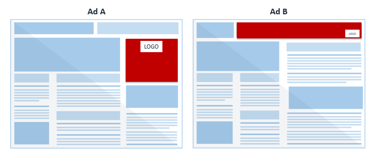
Whilst it might seem obvious that a prominent logo would increase brand recall, this is a factor that made a surprising difference. For instance, in ad A the logo is prominent and visible throughout the ad directly above the key concise and compelling message. Where as in ad B, the logo is much smaller and in the bottom-right hand corner away from the messaging, making it difficult to connect the brand to the product benefits. Given the shape of ad A, the viewer reads from top to bottom, making the logo the first thing they see. For ad B’s layout, the viewer reads from left to right risking them navigating away before they see the brand logo. Of those who recognised ad A, 82% could recall the brand, whereas this was only 37% for ad B.T
The clock is ticking, get to the point
So, you have their attention and they remember your brand, but how do you land your message? Ads that performed well in attention, recognition, and brand recall did not always convey their message. Lengthy ads with complex messages failed to make their point before the user navigated away. For example, ad C was 16 seconds long, and did not introduce its key message until the 14th second. Despite its strong branding, the length of the ad meant viewers lost interest before the message was reached.
Ads with strong messaging tended to be visual messaging (rather than wordy). Brief text with visual cues made the point quickly and required minimum mental effort from the viewer.
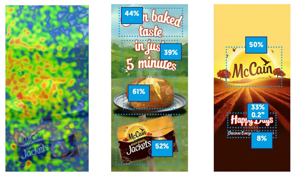
McCain’s tested well under this criterion. Combining short, to the point messaging with bold branding and distinctive assets, McCain converted visual attention to both brand recognition and brand message take-out. These heat maps demonstrate that the viewers’ attention was focused predominantly on the brand logo and messaging. Though the jacket potato and brand message only gained short dwell times (0.4 – 0.8 seconds), their prominence and simplicity meant they performed better than other ads we tested in landing their message.
Ad C
Designing a better digital ad
The digital ad market trades on viewability, and judging by this we might presume that the longer a user looks at your ad the greater the return will be. However, what our use of Lumen eye tracking and Connect:Digital has illustrated is that brand impact is of as much importance as the ad being seen. For your ad to further your marketing message it is crucial that you have the right creative. A well created digital ad that follows our rules for brand impact can deliver recognition at a glance and aid brand impact, when a weaker ad might not perform even with a far longer dwell time.
Rules for strong creative:
- Look Don’t Read: ads that were recognised by over 65% of participants, with less than 4 seconds of dwell time, were designed to work without reading. Long build times and complicated messages are often missed or navigated away from before the main point is made.
- Big Bold Branding: ads that had a positive impact on purchase intent have up front branding, the less successful ads left it to the end. Boldness in brand colours, and a good sized and positioned logo aid recognition. Placing the brands distinctive assets is prominent positions that the user is likely to look to first improves the recognition of the brand and the likelihood of the messaging effecting purchase consideration.
- Get to the Point: ads with impactful messaging got to the point quickly, and didn’t assume that people would watch continuously, they delivered the message up front. Though all digital ad formats can provide brand impact, it is important to be mindful of how people view them. Banners are generally viewed for less time and less often, making a concise message crucial.
- Strong Visual Hierarchy: diagnosing where your viewer is likely to look and focusing your message there is more likely to lead to brand impact. If your ad is likely to be read from top to bottom, the top half is more likely to gain attention.
- Remember: viewability doesn’t equal attention, attention doesn’t equal brand impact. Good ads make their point quickly and clearly.
- https://www.marketingweek.com/2017/04/25/uk-ad-spend-digital/
- eMarketer US Digital Spend predictions, 8 March 2016 (http://www.emarketer.com/Article/Digital-Ad-Spending-Surpass-TV-Next-Year/1013671); eMarketer predictions, June 2013 (https://s-media-cache ak0.pinimg.com/236x/f9/50/0d/f9500d5429ea34392c94fbc701d2d218.jpg)
- Source: Ipsos Global Trends Survey, Sep – Oct 2016. Base: 10,412 adults across 23 countries, online.
- Source: Ipsos MORI and Lumen study, March. Base: 1,074 adults, online.
